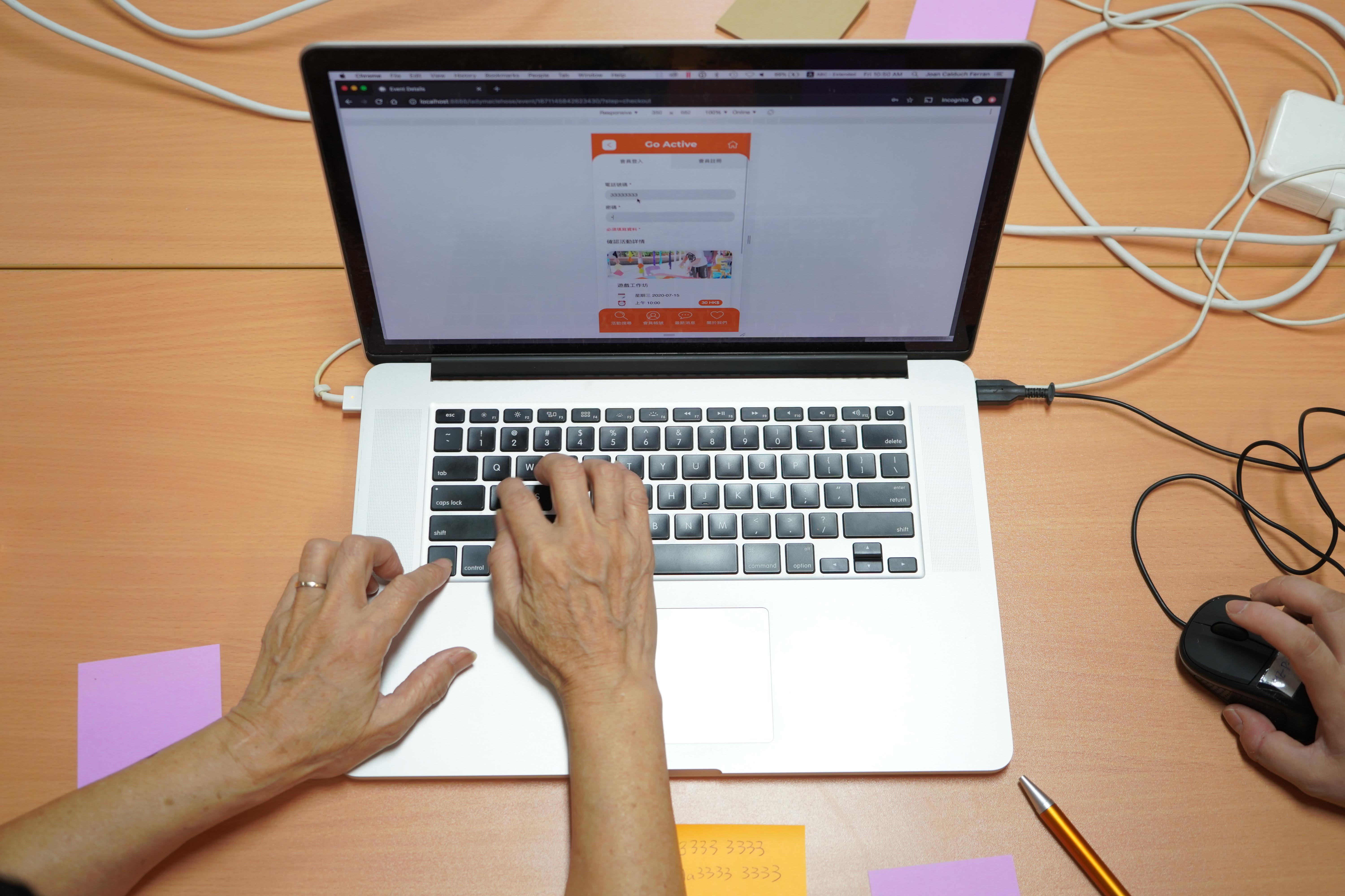
Most of the elderly centres in Hong Kong disseminate activity information through their monthly newsletters to their members. As the elderly is becoming more proficient in the application of technologies, we would like to bring offline elderly centre activities information online, creating an O2O operation model. We believe this could help elderly centres to reach more elderly, at the same time provide elderly with a new channel to easily acquire activities information.
After the Season 5 “Re-imagine Elderly Centres” "One from Hundred Thousand" Social Innovation Symposium organised in November 2019, the Jockey Club Design Institute for Social Innovation (JCDISI), H.K.S.K.H. Lady MacLehose Centre Dr. Lam Chik Suen District Elderly Community Centre (hereinafter referred to as the "Centre"), and design consultant Studio Doozy collaborate and develop an online platform for elderly to search for upcoming activities to be held by the Centre. Being the first online event listing platform for the elderly centres in Hong Kong, we hope that the design results of GOActive.hk can inspire the industry in improving service quality through making good use of technology.
About H.K.S.K.H. Lady MacLehose Centre Dr. Lam Chik Suen District Elderly Community Centre
Located in the mid-levels of Kwai Tsing District, the Centre is relatively remote and difficult to reach. The Centre understands that the geographical location would be unfavourable to the elderly, hence they often organise innovative activities that attract young olds with better mobility. . In addition to the elderly living in Kwai Tsing district, the Centre actually wants to widen it target audience to all elderly in Hong Kong concerning recruitment. The staff used to rely on distributing leaflets at large-scale events in other districts to recruit new members, which requires considerable human resources. Sometimes, the leaflets look dull and could not effectively attract the elderly as reported by the staff. The establishment of this online promotion platform which can facilitate event promotion in different ways was welcomed by the staff.
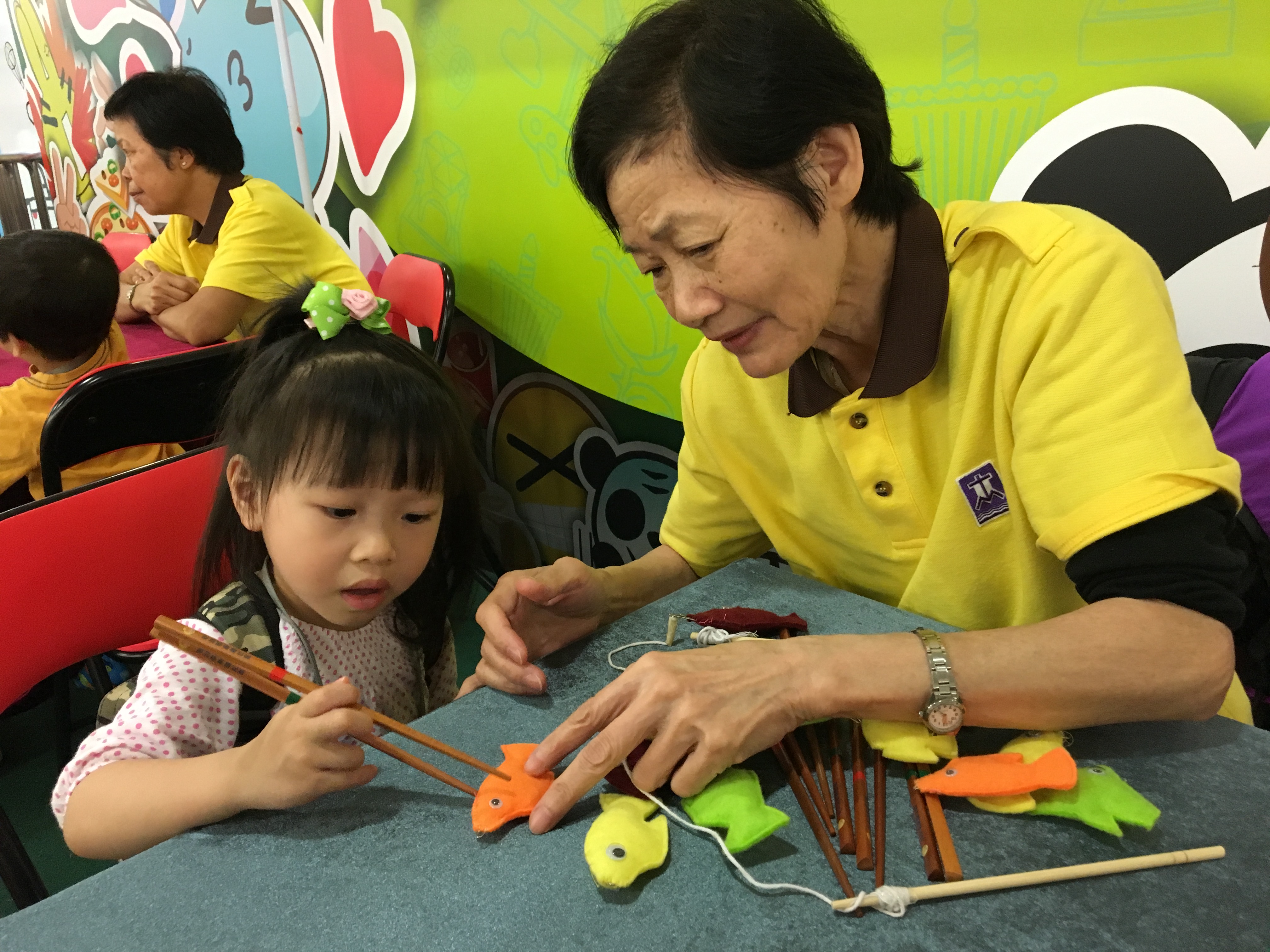
Programme Overview
During the design process, we discovered the needs of different stakeholders, including Centre’s Management, Centre’s Staff, Centre’s elderly members and non-member elderly, through several engagement workshops, in order to design an elderly-friendly platform that is suitable for the centre:
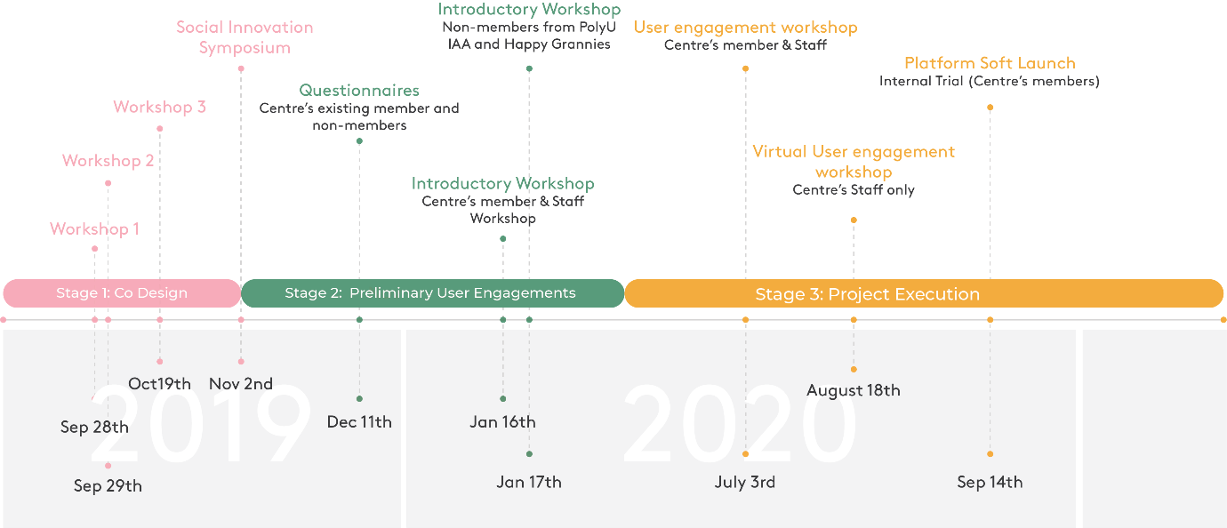
Stage 1: Co-Design (Workshops & Symposium)
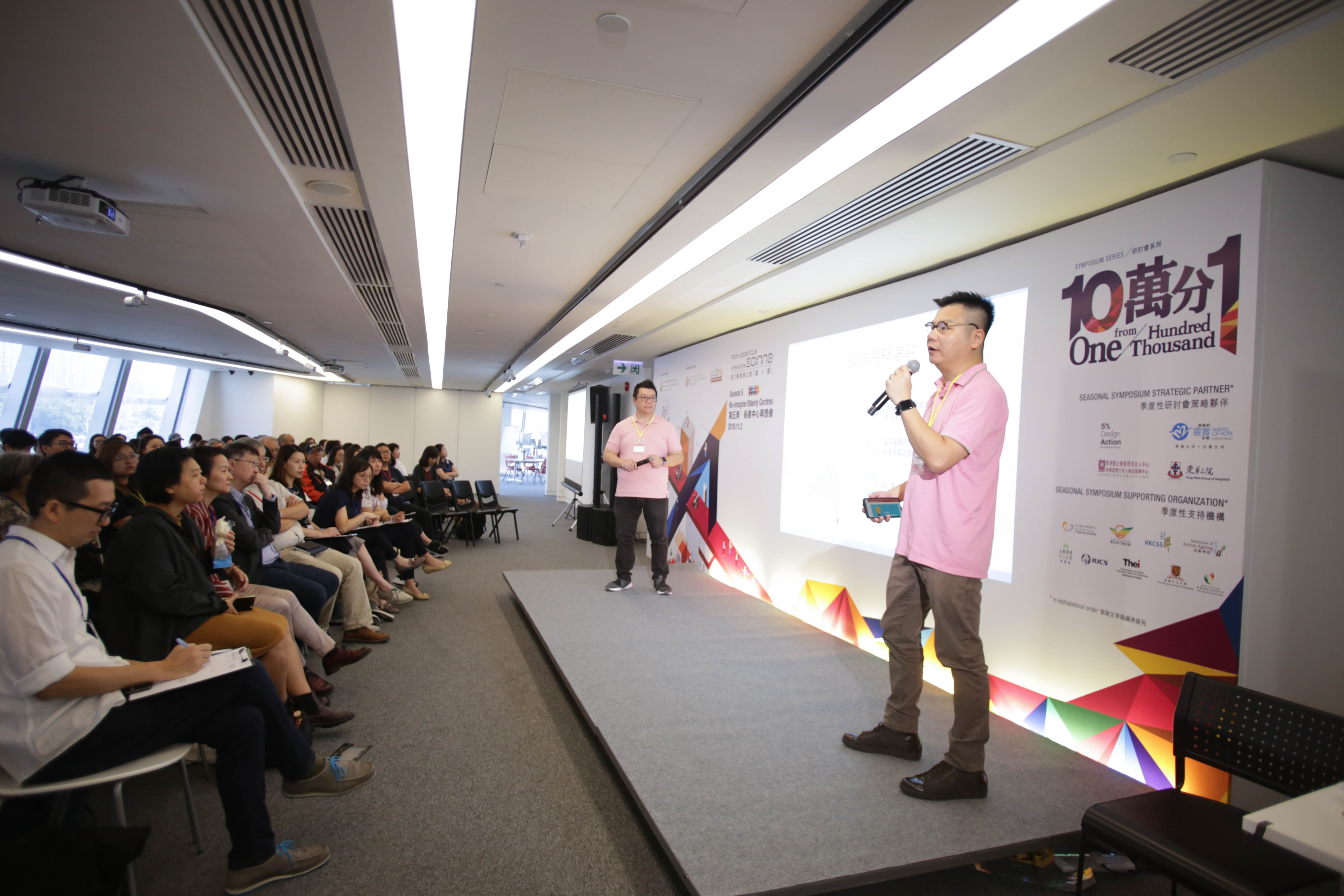
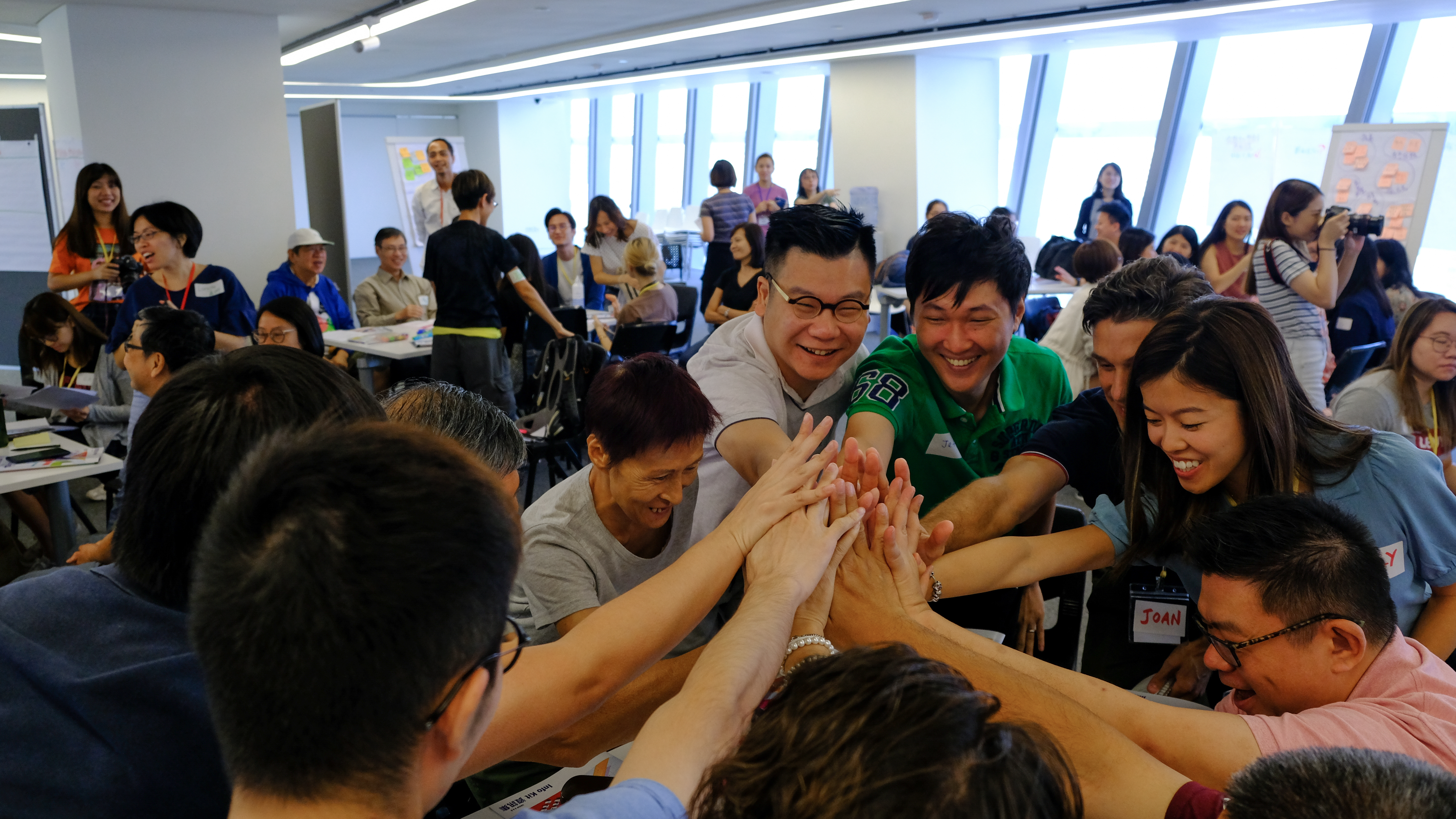
Three workshops were organised on 28 September, 29 September and 19 October 2019, to enable participants to use design thinking strategies to generate ideas and simple prototypes according to the design challenges. Organised by JCDISI, these workshops had participants ranging from Centre Operators (NGOs), Centre Users (Elders) and public participants. The teams also carried out field research, interviewed stakeholders, sent out questionnaires to gather preliminary findings and solutions.
Stage 2: Preliminary User Engagements (prior to project execution)
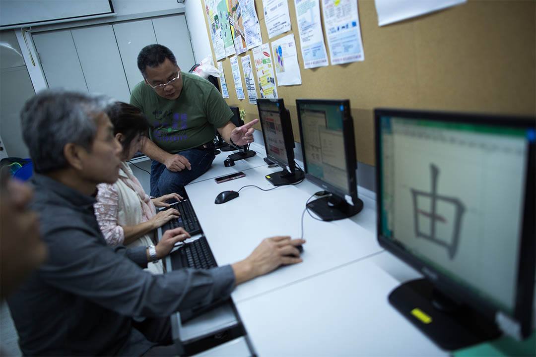
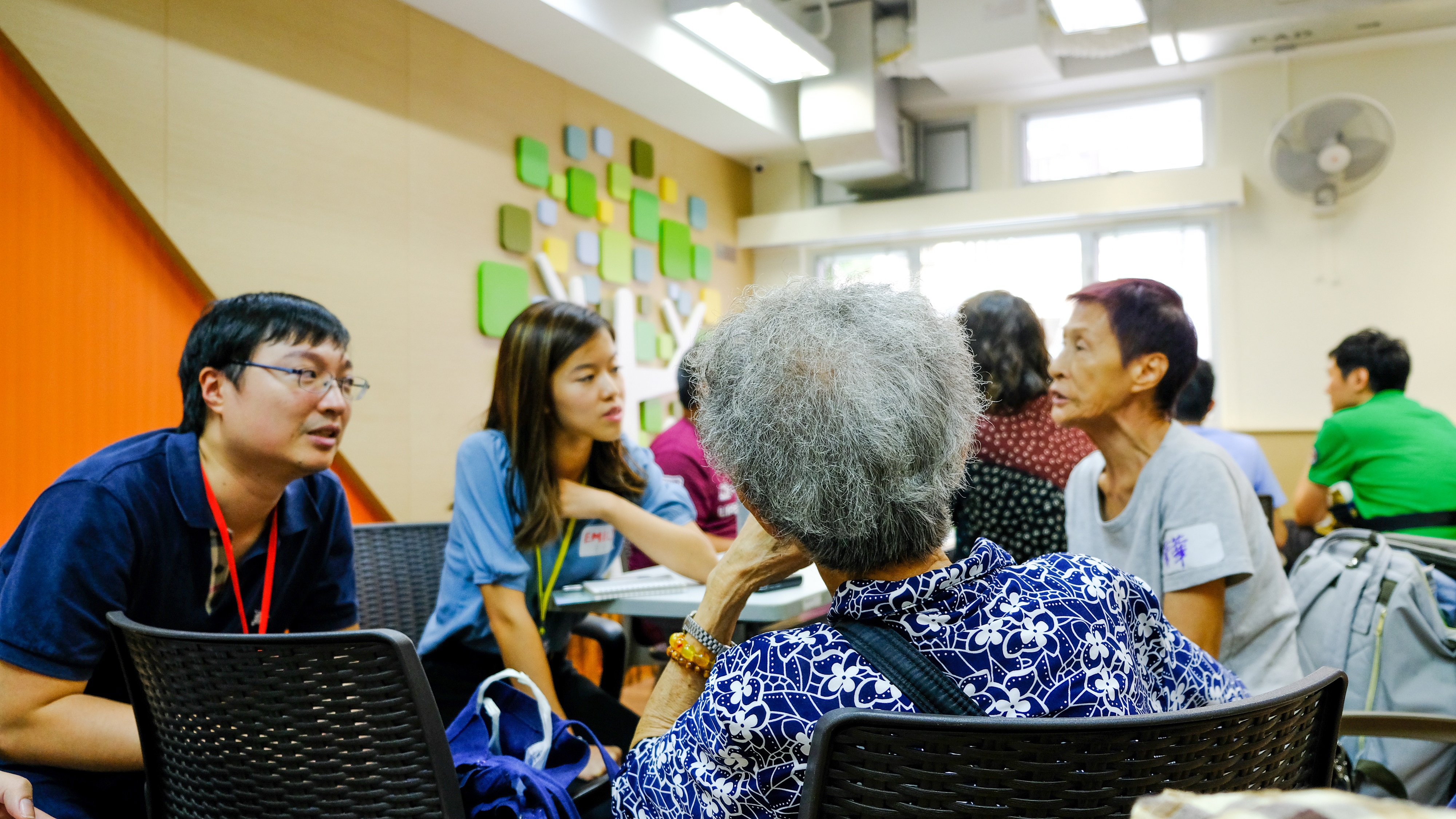
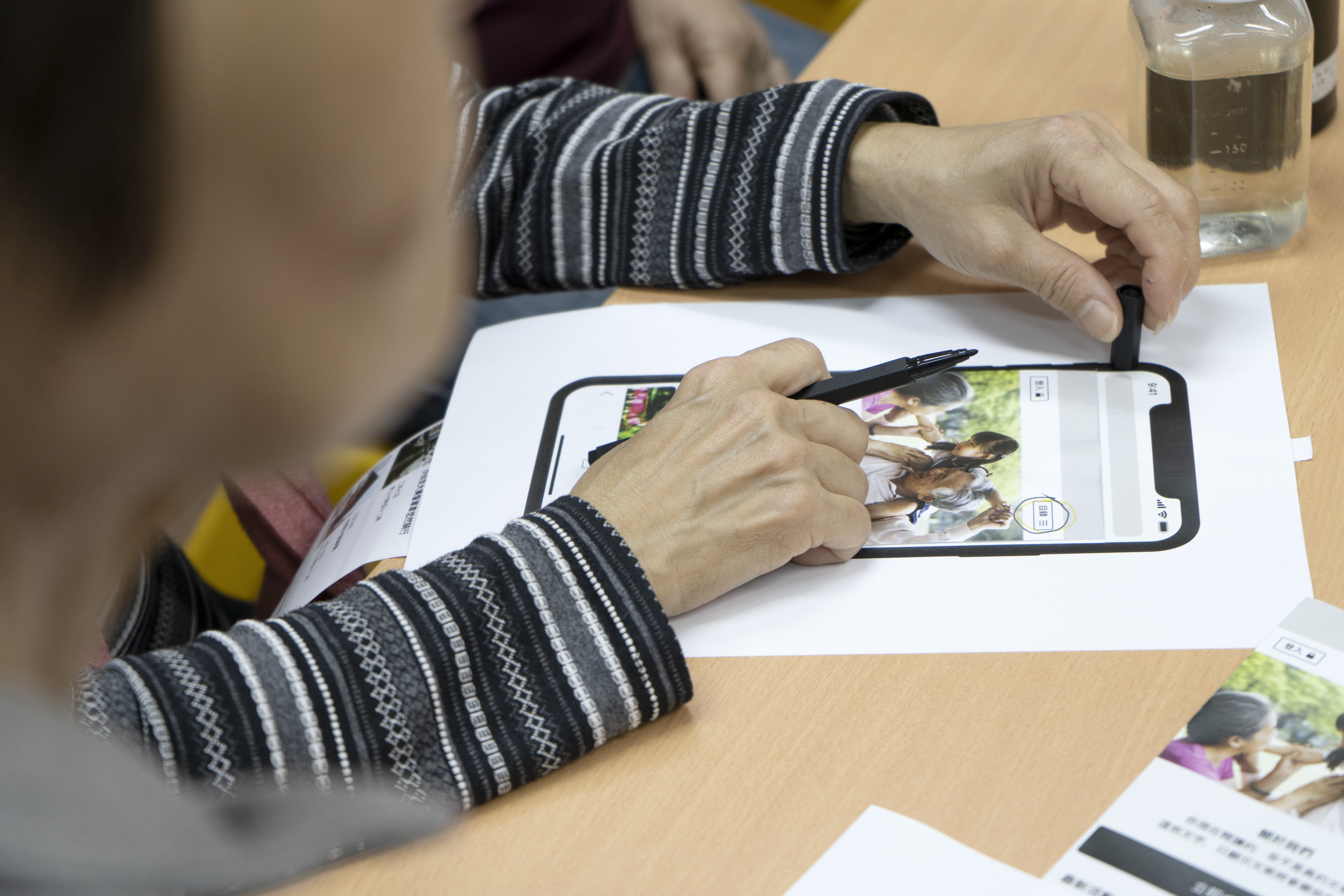
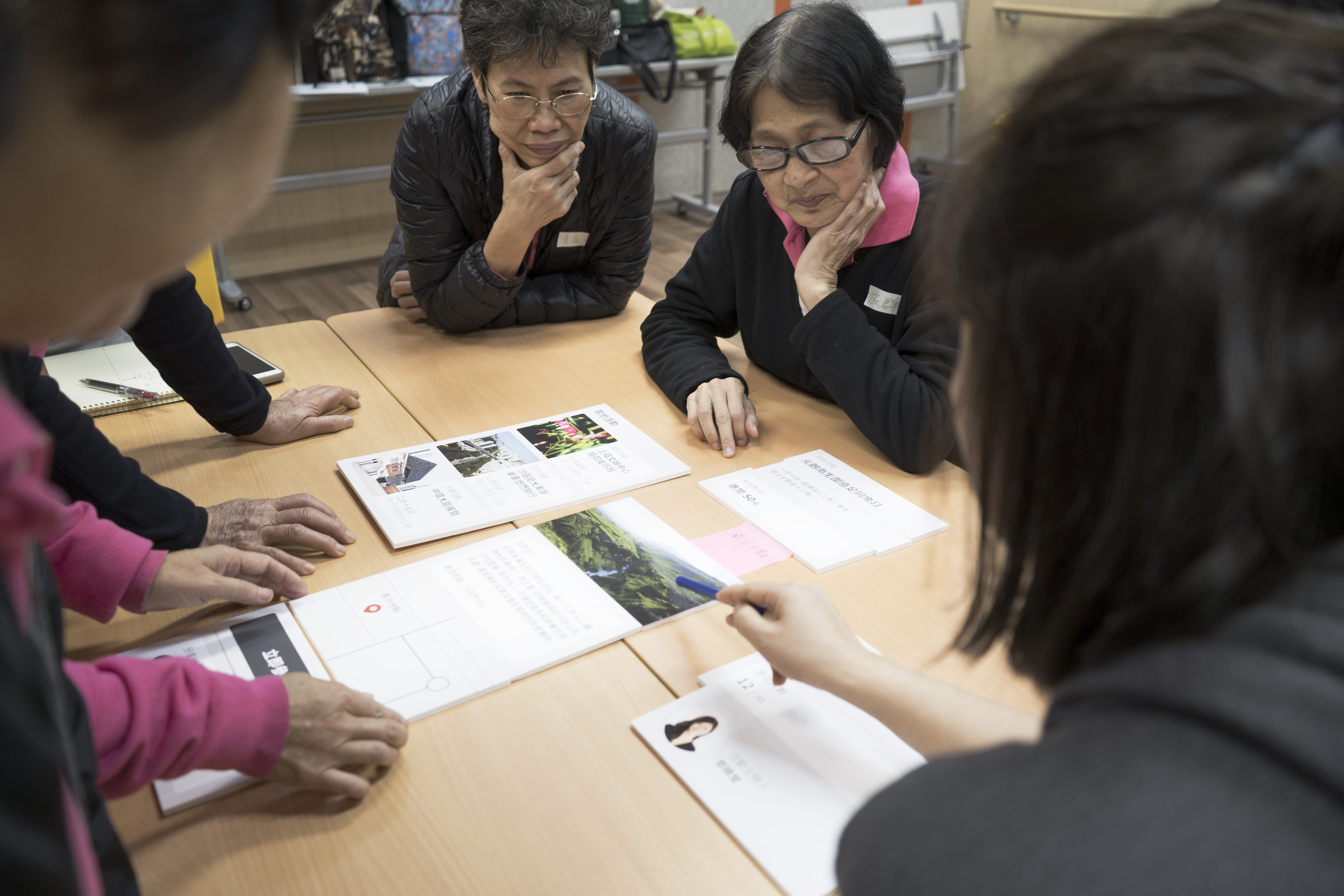
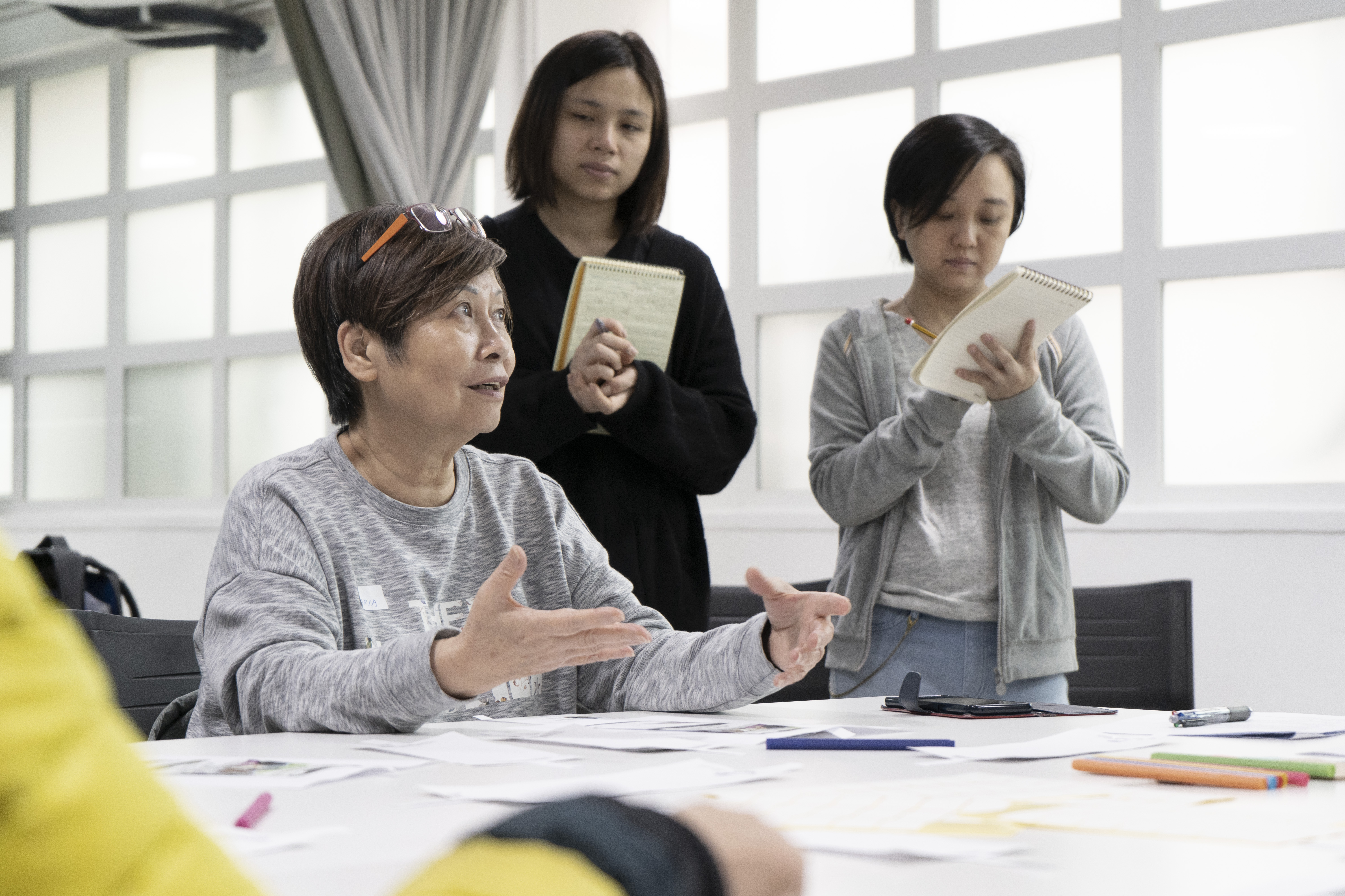
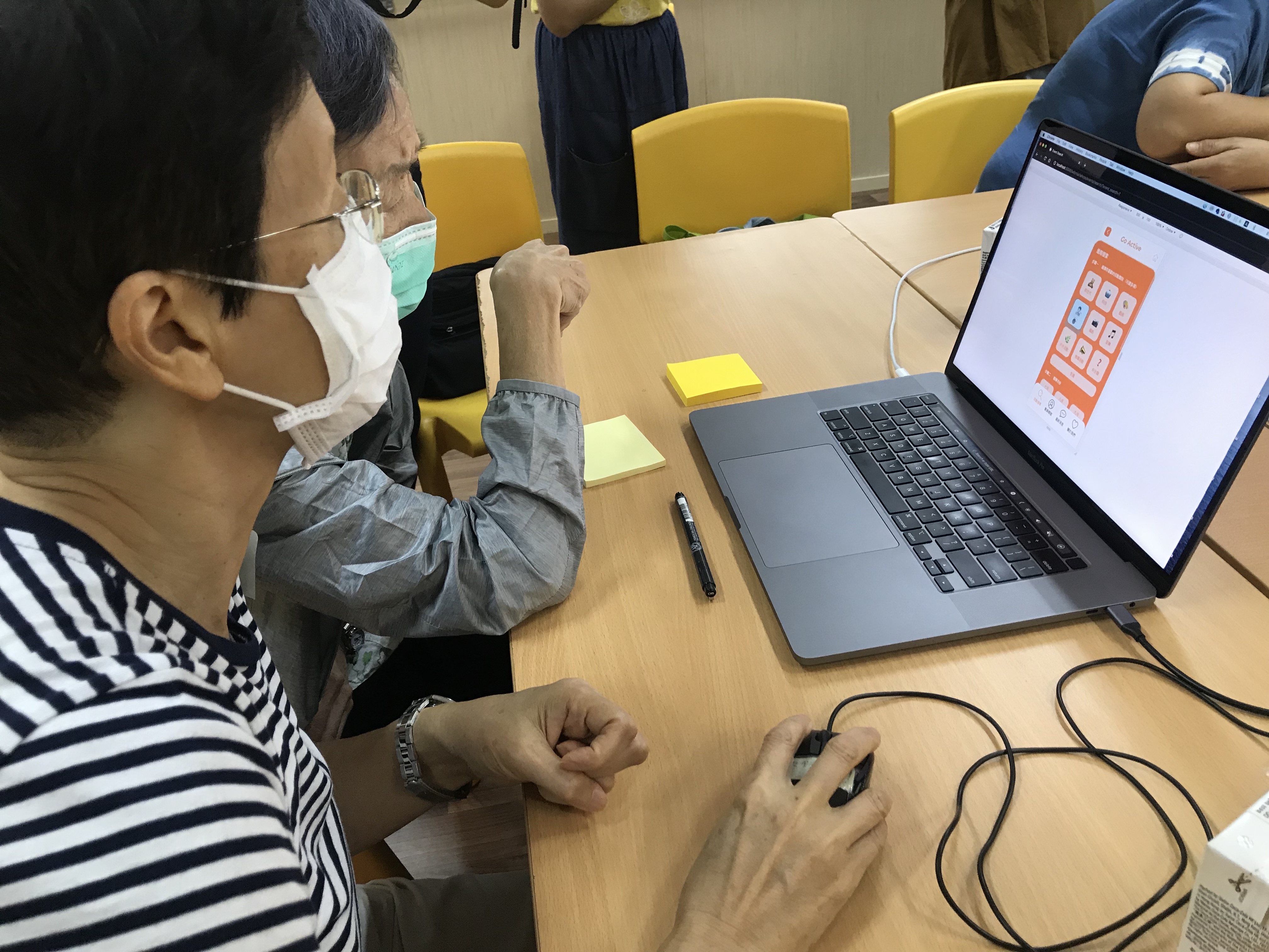
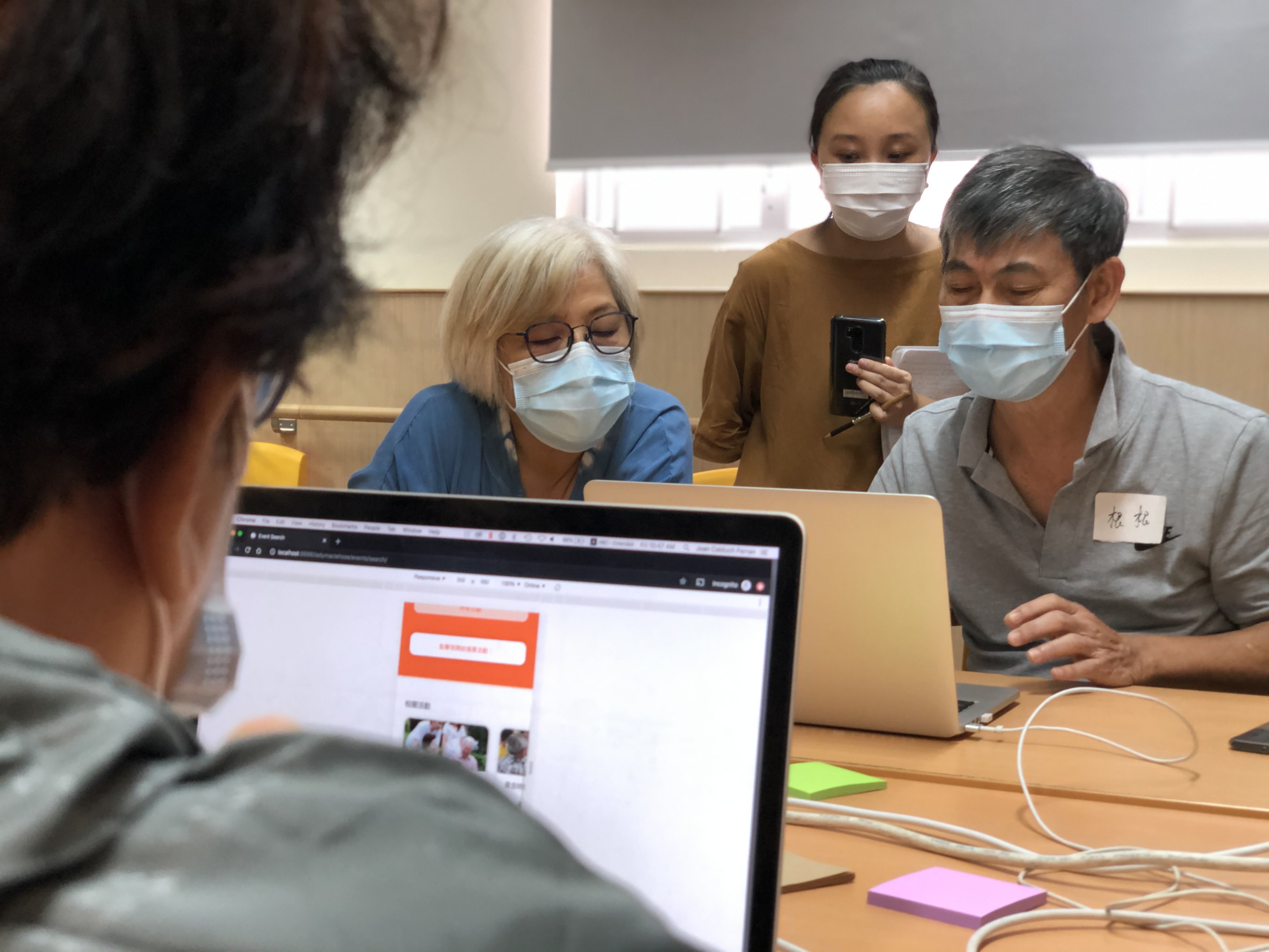
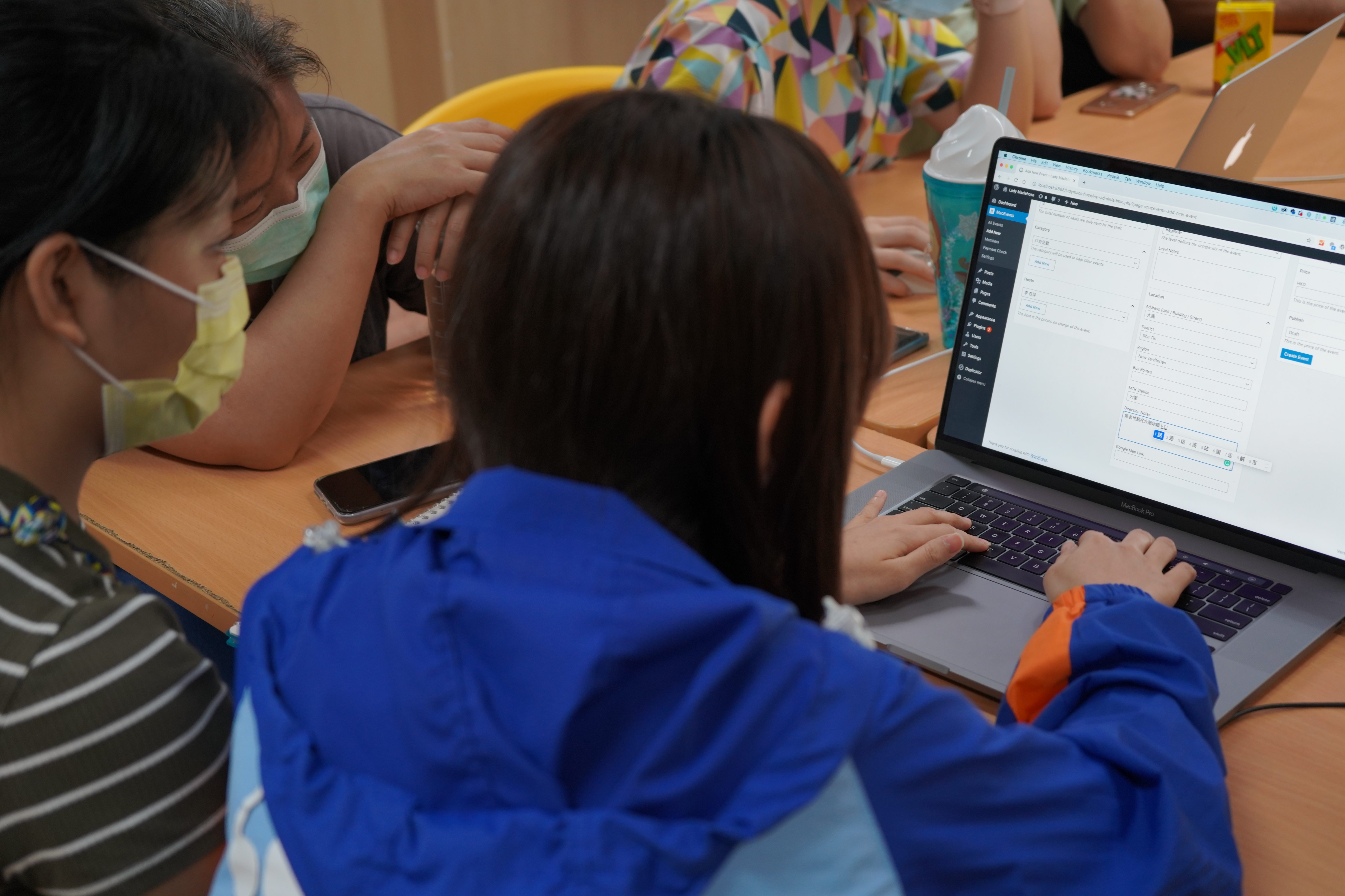
After the Symposium, Studio Doozy was invited as the Design Consultant along with the Centre operators and members to realise the concepts based on the findings and ideas generated from the three-day workshops. To further gather more insights, two questionnaires were sent out to 90 Centre’s existing members and 28 non-members from the Institute of Active Ageing of The Hong Kong Polytechnic University and The Happy Grannies Association. Three introductory workshops were also prepared for the Centre’s staff, Existing Members and Non-Members; the three groups of stakeholders of the project, to better understand their level of proficiency with technology and their needs and requirements.
Stage 3: Project Execution
Multiple prototypes were generated and refined based on constant user engagement workshops with the Centre’s staff and existing members during the year of 2020. It was expected to have a platform launch day accompanied with an event that could promote the platform and the Centre but due to the pandemic, unfortunately, it has been postponed until the situation gets back to normal.
GO Active
The platform was named “GO Active” for the following reasons:
- The platform aims to encourage elderlies “go active” - by making the exploration, discovery, and registration process of elderly centre events more straightforward, encourage more social participation, thereby promoting active ageing.
- "GO" is an acronym for “Generation Orange” (橘世代), which in Japan and Taiwan generally refers to the healthy young olds aged between 50 to 65 with active social participation.
Design Principles
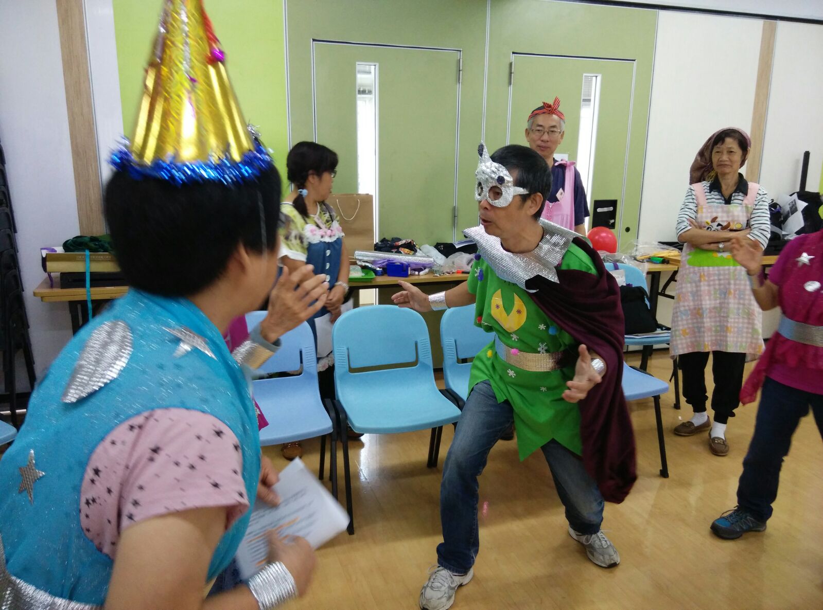
The following is a quick overview of all the design principles that were concluded throughout the workshops established. These design principles provide insights to design a user-friendly and easy maintenance interface for both the platform’s users (front-end) and staff (back-end) and to design an innovative programme that demonstrates active ageing and help promote the aforementioned platform.
Stakeholder: Young Olds
|
Design Principles |
Considerations |
|
1. Content Layout |
· Information Hierarchy · Instinctual Copywriting · Clear and concise copywriting · Consistency in page elements · Picture and copywriting proportion |
|
2. Action and Reaction |
· Immediate reaction after action · reaction from lack of action |
|
3. Colour |
· Legibility · Connotations |
|
4. Instructions / Guidance |
· Clear instructions · Clear guidance |
Stakeholder: Staffs
|
Design Principles |
Considerations |
|
1. Sustainability |
|
|
2. Reduce resources (time, human, money) |
|
Design Considerations Highlight
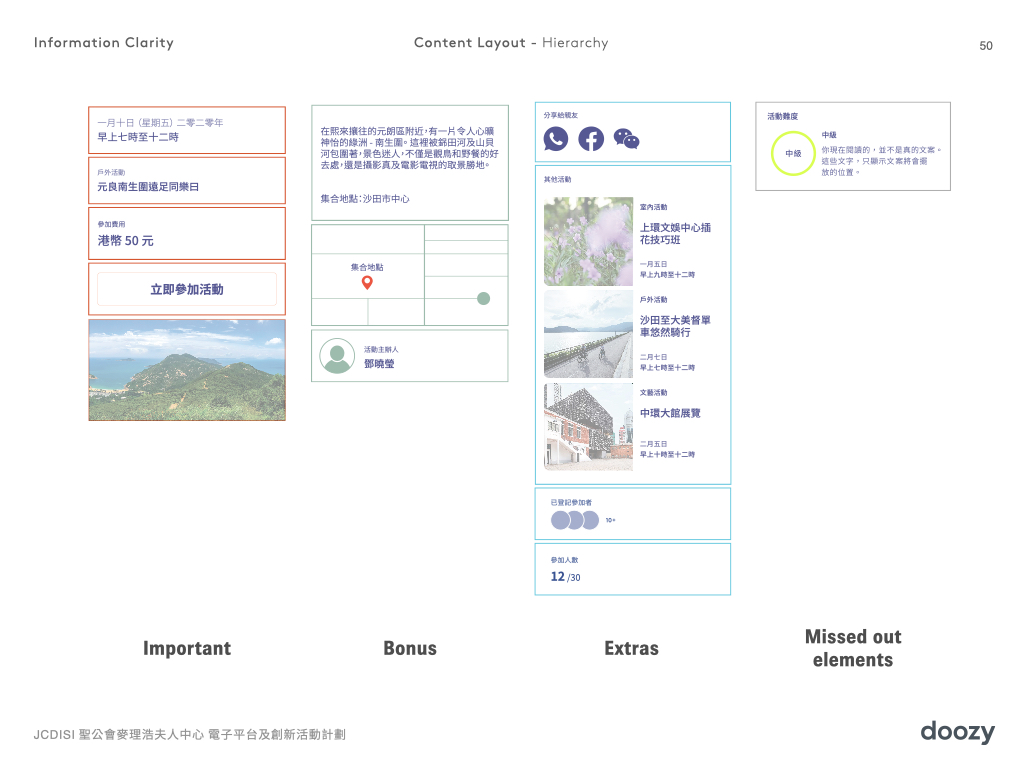
Results from user engagement workshops helped to prioritize the message hierarchy in the layout.
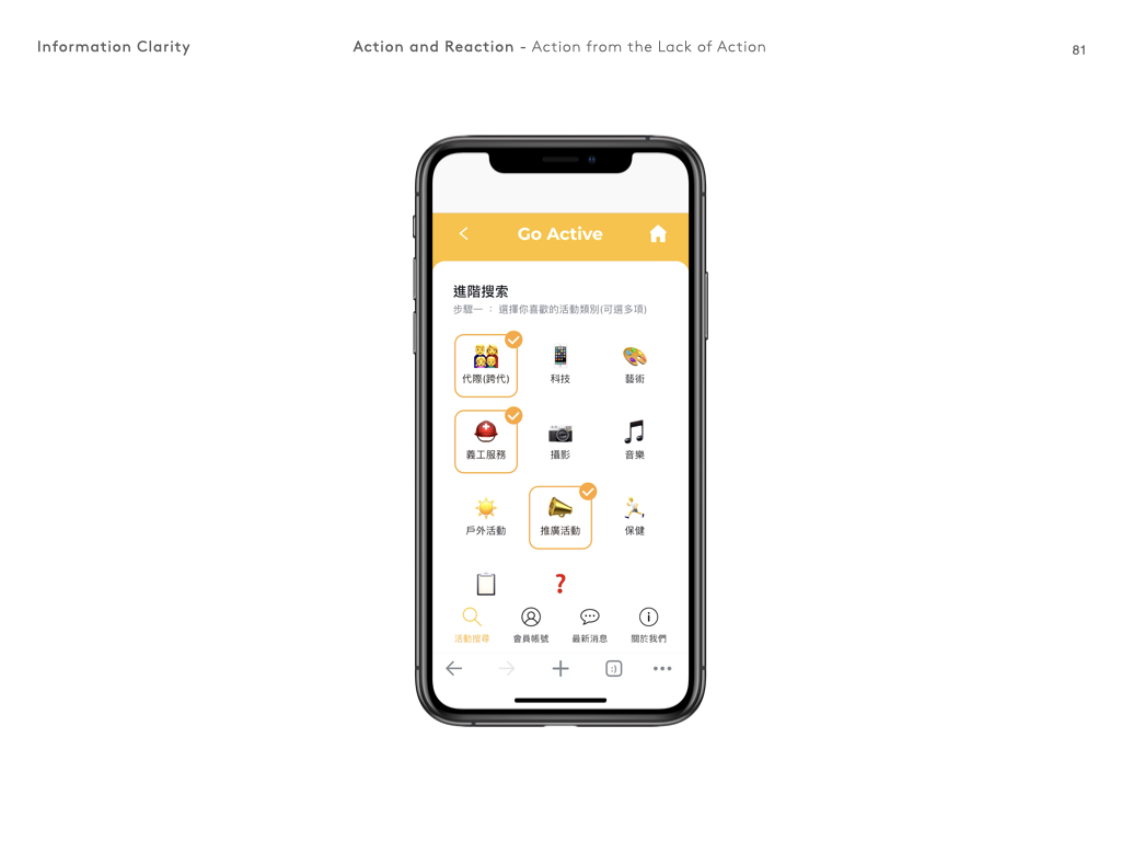
Obvious and indicative immediate reaction to an action is important, e.g. After user pressed a button, the background and border colour will change, and with a tick appear at the top-right corner, so that they knew the system has reacted to their action.
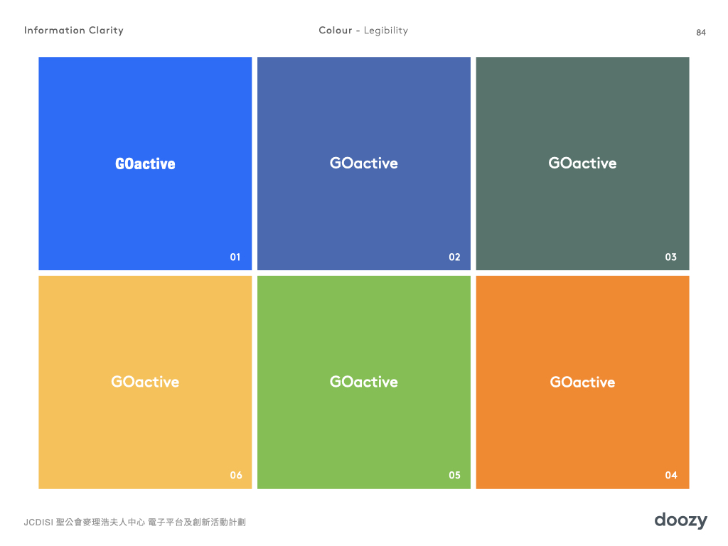
The main colours used on the website are selected base on the readability and connotation concerns of elderly. For example, blue is not a colour welcomed by Chinese culture, therefore it is not chosen as the main colour of the platform.
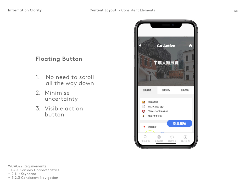
The floating button is designed to be super visible so that users can always find them without any efforts.
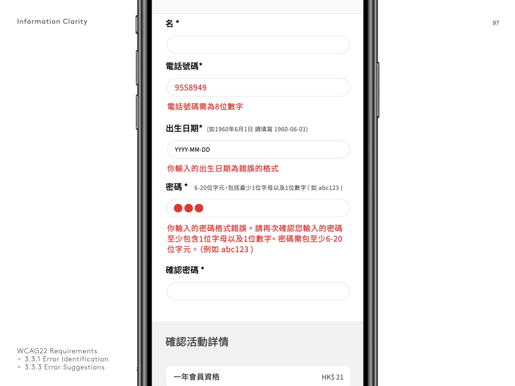 Error messages that appear immediately and state clearly about what is wrong and why is it an error.
